The alpha vs. beta graph shows a plot of a fund’s alpha (on the X axis) versus its beta (on the Y axis). The graph is most useful when comparing multiple funds rather than a single fund, as in the example illustrated by the screenshot below:
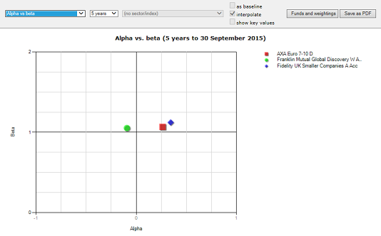
Higher alpha is better, and therefore points towards the right of the graph are better than points towards the left.
Beta is usually considered better if low, and therefore points towards the bottom of the graph are better than points towards the top.
Therefore, broadly speaking, the bottom right corner of the graph is “best” and the top left corner is “worst”.

