N.B. This graph is very difficult to read with more than one fund on it. It is only really designed to inspect a single fund.
The distribution of returns shows the pattern of the fund’s returns each month over the chosen period. The system looks at all the monthly returns, divides them up into bands of 1 percentage point (e.g. 0% to 1%, % to 2% etc.), and then shows what percentage of returns falls into each percentage-point band.
In the example illustrated by the first screenshot below, the single largest group is 3%-4%. Most of the monthly returns fall in the range 1% to 6%.
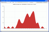
This graph provides an insight into the management style of the fund, and its level of risk. This can be seen by comparing the first and second example screenshots. The first screenshot shows the graph for a relatively speculative UK equity fund. The second screenshot shows the pattern for a cautious-managed fund.
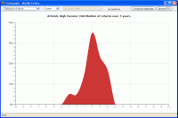
The low-risk fund has a much narrower range of monthly returns, with no values worse than -4% or better than +3% (and the vast majority of returns lie between -1% and +2%). In other words, the graph is proving that the manager is successfully doing their job, and running the fund in such a way that the level of risk to investors is low – i.e. it is cautious-managed.
There are two other general points which may be useful to note, and which are illustrated by the first of the example screenshots.
Firstly, most equity funds are “long-tailed” – they have a relatively low peak, and a large number of returns significantly above or below zero.
Secondly, again with equity funds, significant monthly losses (e.g. -5% or worse) tend to be more common than significant gains (e.g. +5% or better).

