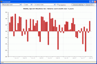
The graph of returns each month simply shows the fund's percentage gain/loss each month as a series of columns. The spikiness of the graph is obviously one indicator of volatility.
You can choose to include the sector average or a stock market index in the graph, and to use it as a baseline so that the fund is plotted relative to it. This is illustrated by the second screenshot.
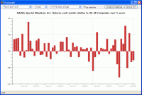
In the two examples to the right the fund has grown much more often than it has lost money (screenshot 1), and has usually beaten its sector average (screenshot 2).

