The performance vs. volatility graph shows a plot of a fund’s annualised performance (on the X axis) versus its volatility over the same period (on the Y axis). The graph is most useful when comparing multiple funds rather than a single fund, as in the example illustrated by the screenshot below.
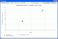
Higher performance is obviously better, and therefore points towards the right of the graph are better than points towards the left.
Volatility is better if low, and therefore points towards the bottom of the graph are better than points towards the top.
Therefore, broadly speaking, the bottom right corner of the graph is “best” and the top left corner is “worst”.
In most cases this graph will bear out the fact that increased performance comes at the cost of increased risk (i.e. volatility).Therefore, as in the example to the right, the funds will roughly fall on a line running from the bottom left of the graph to the top right.

