The widest point of the graph dictates the “mode” value range i.e. the range in which the most answers fell. The probability of achieving the minimum amount of the target goal decreases as you move up the graph.
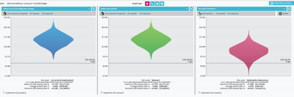
In the example above, the probability diamond looks like this:
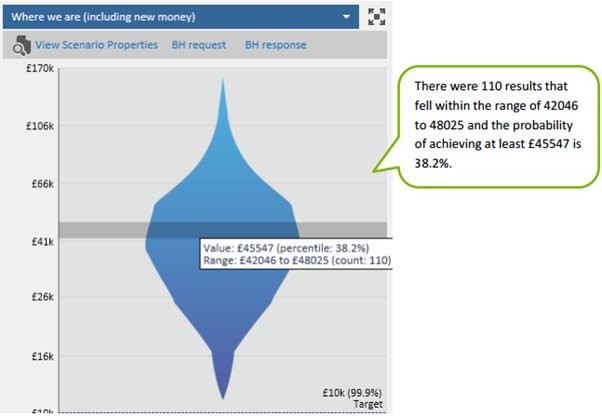
By hovering over the graph you will see confirmation of the number of the 1000 calculations that fell within a particular range of values as well as the value at which the percentile probability of achieving your target goal is indicated.
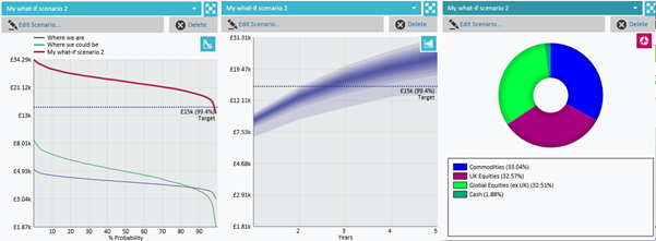
You can view the information in different graph formats by selecting graph type. You can also display the asset allocation by way of a donut graphical illustration (examples of these shown below).