The monthly premium graph shows the performance of a £1,200 annual investment into the fund(s) over the chosen time period.
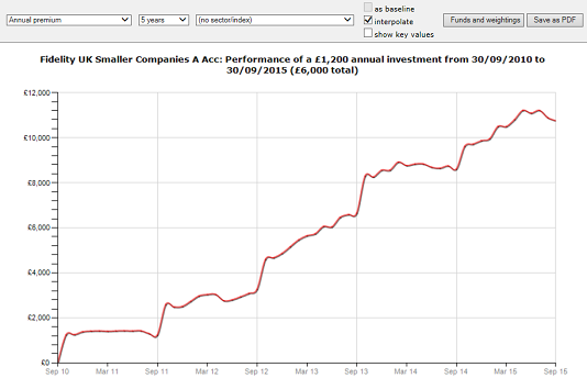
The graph obviously shows an upward spike in value every 12 months when a new premium is invested. The illustrative value of £1,200 is deliberately designed for comparison with a £100 monthly investment.
You can change the time period, and choose to include an index on the graph. The sector average is also available for inclusion provided that all the funds (if there is more than one being graphed) are in the same ABI/IMA sector.

