The portfolio composition graph shows how the split of investments in a portfolio changes over time as a result of each fund performing differently.
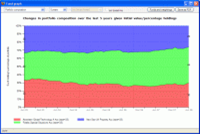
It is particularly useful in helping clients to understand that asset allocations need to be reviewed on a regular basis. For example, if you agree an investment of 50% in UK equities and 50% in US equities today, the weighting of the portfolio will have changed in 12 months’ time, and may nolonger be appropriate for the client’s level of risk.
You set the holdings in each fund using the same Funds and weightings form as with the portfolio value graph. Once again, you can either choose to use the holdings as the current values (and show how the portfolio would have started off n years ago), or use the holdings as the starting point for the graph.
The example screenshot models an investment 5 years ago split equally between a technology fund, a special situations fund and aproperty fund. The property fund has underperformed the other two. As a result,the portfolio weightings are now very different from what was agreed at outset 5 years ago: the percentage invested in property has fallen from one-third toone-quarter. There are almost certainly strong grounds for a review of the client’s portfolio in relation to their attitude to risk or investment objectives.

