N.B. When inspecting multiple funds, this graph is only available if all funds are in the same ABI/IMA sector.
The sector position graph shows a fund’s performance in each discrete 12-month period versus the spread of returns in its sector, and the sector average.
In the first period illustrated by the screenshot below, the worst fund in the sector lost 30% and the best fund gained just under 50%. The sector average was just under 20%.
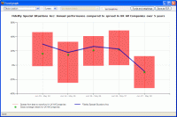
In this first period, the fund being inspected beat the sector average by a substantial margin, but then fell back to match sector average for the last two periods.
The purpose of this graph is obviously to compare how a fund has performed compared to its peers in the same sector.

