The monthly premium graph shows the performance of a £100 monthly investment into the fund(s) over the chosen time period. One of its uses is to demonstrate to clients the potential benefits of pound-cost averaging.
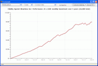
Performance will obviously be much smoother than for a lump sum investment. Typically, the graph only begins to become “jagged” during the latter stages of the investment, when each new monthly premium represents only a small percentage of the overall value of the investment, and the overall investment therefore becomes more and more determined by the fund’s performance.
You can change the time period, and choose to include an index on the graph. The sector average is also available for inclusion provided that all the funds (if there is more than one being graphed) are in the same ABI/IMA sector.

