There are three ways in which portfolios can be used for graphing:
Graphing the performance of the portfolio as a whole
You can graph the performance of the portfolio as a whole in two ways:
- Click on the Portfolio link to view the portfolio settings, and then click on the Graph button at the bottom of the pop-up screen.
- View the portfolio report, and then use the Graph Portfolio link in the report's menu bar.
This provides access to all the usual fund graphs, allowing you to inspect various aspects of the portfolio’s performance.
Graphing the individual constituents of a portfolio
You can graph the individual constituents of a portfolio in two ways:
- View the portfolio report, and then use the Graph constituents link in the report’s menu bar.
- On the main filtering screen for the manual fund list, use the Graph button in the top right of the grid of funds, next to the Factsheets button (i.e. the usual way for graphing multiple funds from a piece of research).
Using a portfolio as a custom baseline
Finally, portfolios can be used as a baseline in any other type of fund graph. The example below shows the fact that any portfolios you create are available as a baseline, along with the usual options to include the sector average and indices.
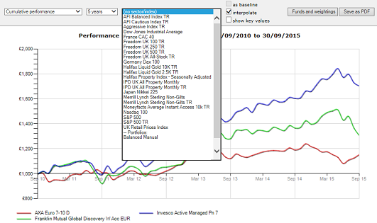
Therefore, when graphing any fund from any point within the software, you can compare it against any of the portfolios you have created.
Note that any Manual Fund List where you haven’t changed the title before saving it as a portfolio will be shown simply as “Manual Fund List”, which makes it very difficult to determine the content.

